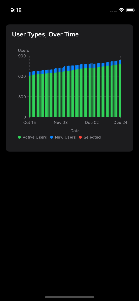
SwiftUI Charts are a flexible, relatively simple way to generate data displays for your application. Apple uses them, in a lot of their own applications.
By default, they are fairly static displays, but it’s possible to add some interactivity to them.
In this series, we’ll take a basic static bar chart, and add two gestures to it: A tap/swipe gesture, to indicate selection of an X-axis point, and a magnification (pinch) gesture, to “zoom in” to specific ranges, on the X-axis.
In this post, we’ll start with a small running SwiftUI app, displaying a simple, static, bar chart.
Starting Point
We won’t be covering all the various ins and outs of SwiftUI Charts, in this series, so we’ll start with an already-functional chart demo, referenced at this GitHub repo. We’ll use tags in the repo, to represent stages of the work we do, as we progress through the demonstration.
It displays a series of data points, encompassing 71 days, with each point, representing one day. The value at that point will actually be bifold: It will be two types of users, of an arbitrary system (actually, the chart data comes from some anonymized stats for the Recovrr app).
There are two types of users: “new” users, who have been assigned a login, but have never actually used it to log into the app, and “active” users, who have logged in, at least once.
On any given day, the app has a number of “active” users, and “new” users.
So our X-axis is dates, with each unit being one full day (24 hours).
Our Y-axis is a “stacked” bar, representing active users, and, on top of that, new users.
Project Structure
The project will be an extremely basic SwiftUI app, aimed at iOS/iPadOS. All of our work will be done in the Workspace for the project. We’ll be working in just one single file, the DemoChartDisplay.swift file. The other files in the app will be sequestered into the Structure directory.
The Working File
We will work on this file only. The other files will be left alone.
Here’s a listing of the starting point DemoChartDisplay.swift file (NOTE: The comments have been removed, to shorten the display. Go to the file, itself, to see the explanations for everything):
import SwiftUI
import Charts

struct DemoChartDisplay: View {
    @State private var _data = DataProvider()

    var body: some View {
        Chart(_data.windowedRows) { inRow in
            ForEach(inRow.userTypes) { inUserType in
                BarMark(
                    x: .value("Date", inRow.sampleDate, unit: .day),
                    y: .value(inUserType.description, inUserType.value)
                )

                .foregroundStyle(inUserType.color)
            }
        }
        .chartYAxis {
            AxisMarks(preset: .aligned, position: .leading, values: _data.yAxisCountValues()) { _ in
                AxisGridLine()
                AxisTick()
                AxisValueLabel(anchor: .trailing)
            }
        }
        .chartYAxisLabel("Users")
        .chartXAxis {
            AxisMarks(preset: .aligned, position: .bottom, values: _data.xAxisDateValues()) { inValue in
                if let dateString = inValue.as(Date.self)?.formatted(Date.FormatStyle().month(.abbreviated).day(.twoDigits)) {
                    AxisGridLine()
                    AxisTick(stroke: StrokeStyle())
                    AxisValueLabel(dateString, anchor: .top)
                }
            }
        }
        .chartXAxisLabel("Date", alignment: .center)
        .chartForegroundStyleScale(_data.legend)
    }
}
The DataProvider Struct
Most of the app functionality is actually in the model, which is represented by the DataProvider struct.
This structure consumes some CSV data, and turns it into a DataFrame. It then exposes some computed properties and functions that interpret and present the data in a form the Chart type can use.
There’s a couple of properties and functions in the DataProvider struct that will help us, once we get to the gestures, but don’t really mean much, at this point. For example, it allows us to define a date window, to select subsets of the data, and it also allows us to select a row.
The Rendered Chart
This is what the initial chart looks like (iPhone 13 Mini on a simulator):
The tag that delivers this image is 00.Starting-Point.
Onward and Upward
We are now ready to start adding gestures.
