 Chris Marshall
Language Barrier
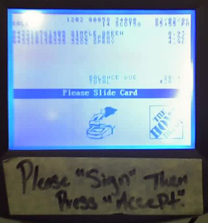 I was shopping in a self-checkout at a Home Depot, when I accidentally entered Spanish Language Mode. I think the software had a bug, in that the button “hot spots” were too wide. Apparently, this was a pretty big problem, as this sign shows (The “Accept” button was near the “Spanish” button):
Apparently, it is an even bigger problem, as this story shows:
Man takes pry bar to self-check till
Machine whacked after speaking to him in Spanish
“Well, let’s look at it this way: At least, this guy wasn’t buying a blowtorch.
But that age-old adage — that patience is a virtue — somehow slipped the mind of a man shopping at Home Depot on Utah Avenue South in Seattle on Thursday.”
Which Way?
A picture is worth a thousand words:
Stuck Drawer
I’m in a Tokyo hotel room, and there is a small chest of drawers. I usually open the drawer and put in my clothes if the stay will be more than one night. However, this drawer won’t budge. What’s the problem?
 The drawer has its handle on the top, as opposed to the bottom. This results in two face plants. The first is that we usually expect the handle (the opening affordance) to be on the bottom of the drawer. Since the groove is hidden when the drawer is closed, I did not see it until after I had tried to grip the drawer on the bottom. The second is that you need to press down in order to open the drawer. This causes it to press harder into the rails, and makes it more difficult to open.
Suggested Solutions:
Place the groove on the bottom of the drawer.
I’m not sure about this, but the drawer slider rail mechanism doesn’t seem to be very good. This may actually be damage done to it by months of being pressured.
At this building I go to, I am always hearing a brief elevator emergency bell ring. I had never thought about it. We have the same elevators at my job, and I never hear it there. One day, I decided to give the matter a little thought, and I figured it out. What are the differences between the elevators at work, and these ones?
- The doors close a lot more slowly on these ones. The ones at work close as soon as someone presses a floor button.
- The people only come here once a week, so they are not as familiar with the elevators as they would be at my office.
Now, couple that knowledge with the following (bad, I know, but I used my phone camera, which stinks) picture:
Can you figure out why I keep hearing the elevator alarm bell ring?
Truck Tires
Last summer, they rebuilt the supermarket near my house. This involved knocking it all down, temporarily sending all the rodents over to my place, and then rebuilding a monster three times the size of the old one. This has been, for the most part, a rousing success, but I have noticed one sign of a rather poor planning process.
The loading docks are behind the supermarket, on the East side. Trucks generally come in off the main road that runs North of the supermarket, down a side road that runs East of the parking lot, into the East entrance. After that, they need to do a fair bit of jockeying to back into the loading bays. If anyone has ever seen an eighteen-wheeler back into a loading bay, they know that it is a pretty complex project, with many back-and-forth runs. They can also come in the West entrance, and come up behind the supermarket. In that case, this happens only when they leave.
Since the new supermarket is so huge, they had to substantially reduce the size of the parking lot. The trucks don’t have nearly the room to play with that they did with the previous lot. No problem. Truckers deal with this stuff all the time, you say. That’s why they get paid the big bucks.
Here’s the problem:
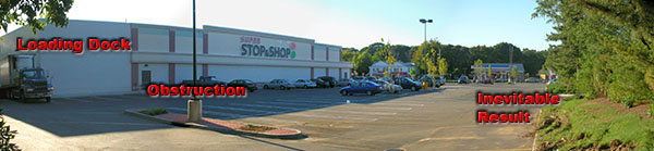
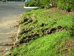 When they designed the parking lot, they underestimated the turning radius of the trucks, so the trucks are forced to go over the curb on the edge of the parking lot. This tears up the landscaping something fierce. After a good rain, the berm looks like a World War One battlefield (minus all the bodies). Those truck tires, and all that weight, are absolutely brutal. The problem, from this amatuer’s eye, seems to be that lampost island in the middle of the parking lot. It stands between the truck and the exit. It was obviously put there as part of a pattern. Maybe they were required to have these lights exactly that far apart by code, or maybe it was just a question of aesthetics. In either case, that torn-up grass is very ugly indeed.
Suggested Solutions:
Cut a “notch” out of the berm.
This is the easiest thing to do, but also the least effective. There would have to be a pretty big notch to accommodate all the trucks. You can bet that these drivers are going all out to avoid running over that landscaping, so you need more room than that represented by the tire tracks.
Reduce the width of the entire berm.
This would work, but it is likely to cause problems. For instance a big part of the job of that berm is to hide the loading bays from the houses across the street. If the same height was maintained for the berm, and it was made narrower, the chances are very good that it would erode.
Move the lampost further South, or further North.
As I said, there may be a town code or something that says the lamp needs to be a certain distance from the other lamps, but I’ll bet not. I think the designer just thought it looked good on his/her blueprints. To be fair, I don’t know if I would have figured this out, but I’m not a professional supermarket designer, and they are.
Remove the lampost island completely.
They could easily mount a floodlight on the building itself, or on a post further East.
Why I Don’t Like Touchscreens
I had quite a sobering experience the other day at the supermarket.
Our supermarket has a neat feature at the deli counter. It’s a kiosk with a touchscreen that allows you to “pre-order” your deli order, then go about your business in the store. You come back later, and your order is ready. Very nice.
The kiosk works by presenting you with options, while lecturing you in a voice that reminds you of that particularly pedantic English teacher you had, back in 6th grade. The voice explains your options S L O W L Y and clearly. This means that you are at each screen for several seconds. It usually takes a couple of minutes to make an order.
Well, I made my order, went around and got the rest of my stuff, then came back to pick it up. It wasn’t yet ready, so I had to wait.
As I was waiting, I watched the people using the kiosk, because that’s what I do. I watch people use technology.
There was this one gentleman, and I’m sure that he was a gentleman, that completely altered my outlook on touchscreen technology forever. here’s why:
He seemed very nice. In his late forties or so. Well-dressed in a casual sort of way. Probably drove up in a Lexus or Mercedes (This isn’t a low-rent neighborhood. I’m the hoi polloi). He was making a deli order. Now, here’s the frightening part:
As he was waiting for each page to complete, he was absently picking his nose. With the same finger he was using to touch the screen.
Ugh.
To make matters worse, just before touching the screen, he would absently lick his finger, exactly as readers do before turning a page.
Double-Ugh.
I don’t know about you, but I’m not using that kiosk again. Maybe I need to wear latex gloves whenever I go shopping.
Sleuth in Need of a Clue
In Borders Books, they have these neat “Title Sleuth” workstations. You are supposed to use these for looking up your books. The UI for the workstations isn’t particularly good, but what always gets my goat is this:
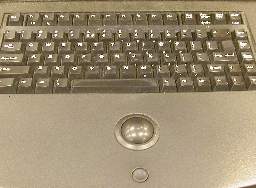
Note the teensy-weensy little left-click button. There is no right-click, which is OK. This is a “kiosk” system, so they want users to follow a custom navigation that the kiosk controls. Here’s the problem: The kiosk doesn’t know whether or not it’s a computer.
What do I mean by that? Well, the program that controls the display is a custom Microsoft Windows NT-based system. This is fairly typical of POS (Point Of Sale, not the…other…acronym) systems. The UI (User Interface) for the system is fairly standard Windows NT. The screen is pretty high-resolution, so it’s fairly large. It’s not a touchscreen, and even if it was, I wouldn’t use it. In any case, standard Windows UI is no good for touchscreen. The controls are far too small. You need to customize them for touchscreen applications.
Obviously, the designers want you to use the keyboard for everything. It does work. The problem, though, is that there are a couple of dozen fields on the screen at any one time. When you get search results, you have long list of clickable links. You really need to move the cursor to places and click. I think it is safe to assume that the kiosk was designed with cursor movement in mind. If that is the case, why is the damn mouse button so small?
 I’m not particularly fond of trackballs as pointing devices, but I can accept them. However, that teensy-weensy little Smartie-candy mouse button is awful. In most stores that I have visited, the button is not particularly functional, and you have to click on it fairly decisively in order to trigger it. That is a real face plant right there. You need to “wake up” just a bit in order to select a field. The concave design of the button aggravates this condition, as it is so deep that you may think the button has been pressed enough to work, when it has not been pressed far enough.
The button is absolutely necessary for operation of the kiosk, yet has been made so small that it is non-intuitive, and hard to use.
The concave design of the button is too deep. The button is recessed into the counter top, so you need to press into the counter top, but the concavity in the top of the button makes this difficult. Basically, it is hard to click on things.
Suggested Solutions:
Make the mouse button larger.
Make the mouse button rise above the counter top slightly, and reduce the concavity.
I’m pretty sure the designers deliberately deprecated the mouse button because it was always accidentally being pressed. This would take some testing to get an acceptable shape.
Redesign the UI to eliminate the need for a mouse, and remove the pointing device.
Okay, I don’t like touchscreens, but that would be better than this.
PIN Pad
I was just shopping, and used a Home Depot electronic cashier. The people who shepherd the customers through the registers obviously got sick of the inevitable by-products of the bad design of the register software.

I burst out laughing when I saw this, and I had to take a picture with my phone. It is an expression of frustration. However, the end result is that the cashier looks less professional. It’s not a good idea to look unprofessional when you are dealing with someone’s money.
Can you see what happened? These electronic cashiers are arranged in a group of four, with a (usually bored teenage) cashier (“associate”) attending them. The instructions on the screen refer you to the “PIN Pad,” but most people know these as either “card readers,” or as “keypads.” The attendant obviously got sick of people asking “Where’s the PIN Pad?”, and wrote this up.
In this case, the bad design was in the terminology. The electronic cashier I wrote about earlier had the same problem.
Suggested Solution:
Rename the prompts to say “Card Reader” or even “Keypad” instead of “PIN Pad.”
Move the Card Reader to a more obvious area, as this is a “required face plant” that isn’t working properly.
Label the Card Reader more neatly and professionally.