Face Plants

This entry is part 1 of 14 in the series Usernotes

This is Probably All Demented Rambling

First, let me give a disclaimer. I’m not a psychologist, and I don’t play one on T.V. I’m an engineer with a desire to take advantage of work done by psychologists and behavioral scientists. The terminology I use is mickey-mouse stuff that I’ve made up, or has been deliberately “dumbed down” for public consumption. That being said, I’m satisfied that the concepts are correct, and that’s the important part. I will refer to other sources of information, so you can see where I got this outrageous nonsense, and see what I mean by such awkward terms as “Face Plant.”

What the Heck is a “Face Plant”? Some Kind of Weird Nasal Fungus?

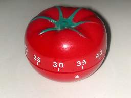
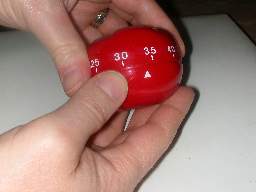
The term “Face Plant” is one that I use to describe those “disjoints” in a user experience. I used to use the term “Cognitive Disconnect,” but that has a loaded (and generally uncomplimentary) connotation; then I tried “Cognitive Incongruency,” but that’s not particularly accurate. For reasons you’ll see, I chose “Face Plants.” Face Plants are the spots in a workflow that make you stop. In some, rare, cases, this is desired (like the launch sequence in a missile silo), but in most cases, it is not. People have written fairly extensively about exactly this type of thing. I’m not saying anything new or revolutionary here, but they also write about a lot of other stuff, and the concept of the Face Plant can get lost amongst all the other highfalutin’ fifty-cent words they use.

I believe that preventing Face Plants is about the most important thing to keep in mind when you are creating a design. If you design consumer products (like I do), then you want to eliminate every instance of Face Plants in your product. Each one consists of a “strike” against your product. Eliminating Face Plants is the “low hanging fruit” of fixing your design. Doing things like simplifying a design (without “dumbing it down”) are far more difficult than looking for the “rough spots.” You can usually drastically improve your user experience with just one or two quick audits for Face Plants.

Some Are More Serious Than Others, or Why I Came up with the Term.

Have you ever gone to a restaurant, and the hostess, while taking you back to your table, points down, and says “Please watch your step.”? She is usually indicating a small step down (very seldom up). This is because that step represents an unforseen event in our routine of walking, and a dangerous one, at that. A step down can cause you to lose your balance and do a face-plant [“Face Plant” -Geddit?] into a passing tiramisu desert. A step up is annoying, but seldom causes you to do more than stub your toe and curse. Much as we may enjoy the vision of Mrs. Rutherford in her Pierre Cardin evening gown, dripping rum-soaked custard, we have to admit that we would not like to be in the same position ourselves.

The idea here is that, when we walk, we are constantly anticipating each step. This is done automatically by our brains in that very primitive part called the Cerebellum. Walking is a very complex act. People involved in robotics can attest to the difficulty inherent in making robots do the simplest walking possible. We are in an unconscious state that doesn’t require the “high priced real estate” of our brains to do the work. In our minds, walking is a (literal) “no brainer.” When we are working in this state, it is the most “pleasant” state possible. It is efficient and smooth. However, when we are “woken” from this state, it is a very unpleasant and jarring experience. This has been known by cognitive psychologists for decades, and has played a major part in establishing workplace standards and processes. Don Norman goes into this kind of stuff in detail in his books “Things That Make Us Smart” and “Emotional Design.”

In any case, “Face Plants” are here to stay. This is my blog, and I thought it up first. It also conjures up a humorous image, and I believe that laughter is good for the soul.

Seriously, though, writers are always coming up with terms that they hope will become the new “universal” term for the concept, such as “blog.” I think that we can safely say that this will never happen with “Face Plant.” It is just too awkward and incongruous. That takes a lot of pressure off of us, and we can just keep going on.

Designing for Dummies

When we design something to be used, as opposed to just experienced (for example, a camera, as opposed to a framed and mounted photograph), we want to make sure that the people who use it are in the “lowest” level of cognitive operation possible. We can seldom get people to operate anything of any complexity at all at the level of the cerebellum, but we can probably get users to operate in the pareital, occipital and temporal lobes. Basically, the “lower” the level of the brain required for a specific task, the easier and more productive the task. A Face Plant is an event that yanks the brain operation from the nice, primitive, low-level operation, into a higher function. It is like slapping someone awake. In most cases, it is nowhere near that uncomfortable. It can just be a mild “darn!” or a quick double-take.

As I said earlier, we sometimes want exactly that. If you have ever installed software, they try and get you to do that with those obnoxious legal EULA displays. In fact, we have become so used to them that we don’t pay attention, and just “click through” in spite of all that silly stuff they do. One day, a truly convincing cognitive psychologist is going to get up in front of a courtroom, and convince them of this. It hasn’t happened yet, so we are stuck with the ridiculous and onerous conditions in most software EULAs.

This means that there are two difficulties in a design:

  1. Creating a design with a smooth “no brainer” operation and no “face plants”; and
  2. Creating a design that has deliberate and effective “face plants” to break people out of the “mode” in which they find themselves.

Number 2 is actually more difficult than it seems. Modern design (especially software design) is full of inadvertent face plants, but when we try to deliberately add one, such as a EULA display, it fails miserably.

Ethernet Socket

This entry is part 2 of 14 in the series Usernotes

I got this great Sony Vaio sub-notebook computer. It is a really kewl little computer, and actually fits into my folder case. It is designed for the “wireless on-the-go executive.” However, there is one problem. When they designed the socket for a physical (wired) Ethernet connection, they made a decision that directly affects the usability of the computer.

basically, the socket cover opens in such a manner that you have to jam your finger in between the cover and the plug in order to squeeze the tab to release the plug. Observe:

The Socket Location
The Plug in the Socket
Both Cables Plugged In

If you have very big fingers, then it will be impossible to remove the cable with your fingers. You’ll need a tool.

I guarantee that many people just rip the cover off. The others just never plug in a cable. I need to plug cables in fairly frequently, as the wired network is a LOT faster than the wireless network.

I’m pretty sure I know why they designed it this way. It probably has to do with getting at the plug while the modem port (located right next to it) is open. If you have a plug in each, then it is very awkward indeed to get at them. However, the modem port is designed to be far more accessible than the Ethernet port. This is an understandable decision. They probably decided that, since this was a travel computer, people would be plugging modems in much more frequently than they would Ethernet cables.

I beg to differ.

I travel a lot, and just about every hotel in which I stay, I use an Ethernet-based connection for high-speed Internet. In some cases, I get a wireless connection. In only a very small number of cases do I have to use the modem port, so any design that favors the modem port is, in my case, a bad design.

Now, Sony is a company that is known for good user design (funny that my first two posts are on Sony products, though.), so I am sure that this was carefully thought through. Far be it for me to second-guess them; but I will anyway.

Suggested Solutions:

Turn the Ethernet plug around.

I’m pretty sure that the reason they didn’t do this already is because there is a real danger of giving youself the “bamboo-splint-under-the-fingernail” treament if there is a wire in each connector. Maybe the risks of being sued outweigh the usability gains. I dunno. No matter which direction the Ethernet plug faces, the modem port cover is very difficult to open when there is a plug in the Ethernet port. I have to remove the Ethernet cable in order to open the modem port.

Exchange the positions of the Modem and Ethernet plugs.

This is merely a reallocation of the priorities. In my case (and, I’ll bet, in a lot of other peoples’ cases), the Ethernet cable is more important than the modem cable.

Egg Timer

This entry is part 3 of 14 in the series Usernotes

The Egg Timer

When I first laid eyes upon this baby in a Radio Shack store, it was love. I thought that I had found the perfect amalgam of technology and usability. Now that I have had a chance to [mis]use the thing for a while, I think differently.

It’s an egg-shaped kitchen timer. It’s precise to the second. It counts up. It counts down, and you set it by turning the base. Much like my old-fashioned analog tomato timer.

The really kewl thing about it is that it’s digital, and digital, as all us geeks know, is better.

So why did I give it away, and why do I continue to use my old analog tomato timer?

Because the damn thing is difficult to use. The neat, turn-the-base setting function is non-intuitive, the display is remarkably hard to read from a distance, and the very precision that first attracted me now gets in the way.

Let me explain. The way you set the time is to turn the base, while holding the top. If you turn the base slowly, the time increments/decrements by ten seconds. If you turn it faster, the time changes by minutes. The actual position of the base doesn’t mean anything. It is the act of turning it that sets the time. To start the countdown, you set it to a time, and hit the silver button on the top. To count up, you leave the unit at zero, and hit the button. When the countdown is over, the egg beeps continuously until you press the button. On the bottom of the unit is a “Reset to zero” button. More on that in a bit.

Let me introduce you to my old tomato analog timer:

What a Tomato

It is very simple: zero to sixty in one turn. You turn it to the desired number, and put it down. When it is done, it dings a bell for about a second. If you want to time less than fifteen minutes, you need to turn it past fifteen minutes, then turn it back. This “primes” the bell. If you don’t do this, the bell won’t ring as loudly. They have increased the number of visible tick marks between zero and fifteen minutes, to one tick per minute, as they figure you’ll need a bit more precision. Above fifteen minutes, they just give one tick mark every five minutes.

Operating the Tomato

It takes me two seconds, and one turn of the wrist to set the tomato to 33 minutes.

Operating the Egg Timer

It can easily take me ten seconds to set the egg to 33 minutes.

Why is this? It is because the time is on the dial for the tomato, and there is no digital readout. You turn the dial to the point that you want. It may not be exact, but cooking is not an exact science. 30 minutes can easily become 35 minutes if your oven is a little cool, or you are using a glass dish instead of a metal one. The digital readout actually hurts in this case, because it encourages you to get to exactly 30:00 minutes. Not 30:07 or 29:40. In a real life kitchen (I cook a lot, so I can speak with authority in this area.), you don’t lose any sleep over a few seconds, or even a few minutes (except when you’re making Hollandaise Sauce, and then you don’t use a timer.)

On the other hand, with the egg, you have to make several complete turns. There is a non-inuitive threshold at which the turning of the base causes the time to increment by a minute, as opposed to ten seconds. I used the egg a lot, and I never really figured out exactly how fast you needed to turn it. This often meant that I had to turn the thing twenty full rotations before reaching my time. When I would get close to it, I’d slow down, and then slowly turn the dial until I reached my desired time. This resulted in a long, drawn-out process.

Okay, in review: One quick twist, compared to twenty-five turns of a dial and ten seconds or more. Which would you prefer?

I gave away the egg.

The egg has one more fatal flaw. On the bottom, there is a reset button. Pressing this when the timer is stopped, will reset the time to 00:00.

The Dreaded Reset Button

However, if the timer is going, holding the reset button will prevent the silver Stop/Start button from operating. It will also prevent it from operating if the timer is off, so the timer will not start when the Reset button is pressed.

Why is this a problem? Let me show you:

Oops

Face Plants:

The “simple” rotating dial actually doesn’t work the way you’d expect.

You need to “wake up” a bit, and spend higher-level brain function on keeping track of the displayed time.

The blasted thing won’t stop/start.

This is because the natural way to hold the egg timer is one finger on top, and your thumb on the bottom. This causes both the reset and the start/stop button to be pressed simultaneously, resulting in…nothing. I have watched smart people staring at the timer for over a minute, trying to figure out why it doesn’t work.

Suggested Solution:

Buy a tomato.

The problem here is that the designers tried to adapt a function to a form. BAD IDEA. This is a digital timer, and it needs a digital interface. They should have developed a form that matched the functionality.

Just for the record, here is a digital timer that actually works. It has a form that matches the function. Boring, but effective:

Setting The Digital Timer

Electronic Cashier

This entry is part 4 of 14 in the series Usernotes

I shop at a supermarket that has the new electronic cashiers. I’m actually fairly bemused at their efforts. At least 30% of the times I’ve used it, the darn thing has had to be babysat by a human cashier. However, even when it does work, it has a really awkward design that I consider absolutely unforgivable.

First, let me show you what it looks like:

The Two-Headed Monster

The unit on the right is the main touchscreen panel. You use this for all your interaction. The unit on the left is a small, standard-issue supermarket card reader with a swipe and a small touchscreen. It is identical to the ones they use at the normal cash registers.

The problem is pretty basic: You use the big color screen for almost everything, until it comes time to pay.

Fair enough. Use the card reader for swiping the debit card and entering the code. It’s slightly more secure that way, and it probably requires simpler (i.e. less buggy and more secure) code to turn it over to the small keypad.

However, the system doesn’t delegate the entire payment process to the card reader. You start with the display you see in the photo. Remember that you have been using the big color monitor for the last five minutes to scan all your groceries. You are standing in front of it and getting all your queues from that display.

When it comes time to pay, the big display asks you for a payment method. I usually use a debit, so I click on the “Debit” button. I am then presented with the display that you see in the photo, where it says to use the keypad. At this point, I experience a slight “face plant” (face plant number one). This is where I go “huh?” and look for the keypad. Note that the big display refers to it as a “PIN Pad.” This is face plant number two. Different manufacturers and stores use different equipment. Most of the modern ones have the card swipe and keypad in the same unit, but older ones would have separate units. It’s quite possible that the instructions would be in a display separate from the PIN entry keypad. I think the terminology is awkward. They should display a photo or drawing of the unit.

Now, I’m pretty sure that these cashier systems were designed to mesh with a number of different keypad systems, and that is one of the reasons for the awkward terminology. Nevertheless, there has got to be a gigantic amount of work in installing and customizing each unit. Part of that customization should be the selection of a module that displays the appropriate image.

In any case, that’s water under the bridge. I’ve found the “PIN Pad,” and I’m reading the little display (The big display says I should follow the instructions on the little display.) I swipe the card, type in my PIN, and wait. The PIN Pad display says something like “Processing…”

What I don’t know, is that now the large display is displaying a cash back prompt, and showing a number of buttons. I’m standing in front of the PIN Pad, like a idiot, waiting for the display to change. This is completely different from the standard routine at a normal cashier. In those cases, the little display has the same message, but the cashier then asks you for the cash back amount. Your attention never leaves the display.

Remember that all my attention is now on the little display. This is a very bad face plant (face plant number three). I have used the same system many times over, and yet I constantly go through the same thing. I am no dummy. Some other customer may have the routine down pat, but I don’t.

Face Plant:

The control flow is suddenly shifted away from the small keypad.

This is especially bad, as you have to move your entire body, and redirect your attention. It completely slaps you out of your “mode.”

Suggested Solution:

Have the main display ask for the cash back amount before turning you over to the PIN Pad.

The Spigot

This entry is part 5 of 14 in the series Usernotes

The Label
The Spigot in Profile
Pulling Down the Spigot

Sometimes, you can look at something, and see a story. That is certainly the case with this spigot on a bathtub tap.

This is the story of a design mistake. That label says “We came up with this neato-wow design, and nobody ever figured out how to use it. Our customer support lines melted down, our resellers blacklisted us, we fired the designer, and stuck these labels onto our product as a mickey-mouse band-aid to the situation.”

As you can see, it is an interesting design. There is a “lip” on the business end of the spigot (you can see it in the second photo.) This has a shape that affords pulling. The user is supposed to pull this down to enable the shower head. It is clever. It probably has very few moving parts, and costs very little to manufacture. Pulling down on the spigot probably moves a baffle into place that blocks water flow through the tap, and forces the water to go up to the shower head.

Too bad they probably blew all their profit on damage control. Customer service is a very real, and often overlooked cost. Good designs require less customer support. Companies need to quantify the cost of support, and then factor that into their design priorities. In this case, they probably saved fifty cents per spigot, and spent a dollar per call. Not everyone who brought one of these would call, but most customers would chalk up the manufacturer as less-than-desireable, and would probably not get any products from that company again. They may also complain to the plumber that installed the system. The plumber might be a bulk customer of the taps, and the company may lose a thousand units as a result.

This is a common problem when designers live in their own world. In the world of bathroom plumbing fixture designers, this was probably an elegant and intuitive solution. I’ll bet that one of the biggest issues with bathroom fixtures is all the various knobs and gizmos. There is always a concerted effort to design “one turn” taps and fixtures. These have varying degrees of success. I have gotten into hotel showers that have frozen me half to death because I couldn’t figure out how to make the water hot, and I have used taps in sinks that force you to drip water all over the countertop because of their placement.

Suggested Solution:

There is no real solution for this without a complete redesign, which is certainly why that sticker is on the spigot.

Off the Hook

This entry is part 6 of 14 in the series Usernotes

I wanted to have phones throughout the house that could be used as an intercom, as well as a way to deploy phones into places where there was no wiring for phones. I checked around, and found that the 2.4 GHz system from GE seemed to have all the right buzzwords.

Normal Phones

The phones do everything they are supposed to do. I don’t especially regret getting them, but that is only because they were substantially cheaper than the other phone systems with the same features. Price was one of my principal factors. If I had paid more, I would have expected better design.

Their look is OK. The handsets fit into cradles for recharging. Many phones with recharging cradles make it easy to insert the phone so that the charging contacts don’t quite meet, yet the phone appears to be seated correctly. These phones don’t have that problem. You just plonk the handset down into its cradle, and the charging light comes up. I think that the keypad is too complex and badly designed, but that is par for the course for all of these types of phones nowadays.

The audio is clear and static-free. The range is fine for everywhere inside (and outside) my teensy little house. The intercom works fairly well, and I have the full complement of handsets (4). Each handset has a unique name that appears when using the intercom.

I have three complaints:

  1. When using the intercom feature, a loud, obnoxious beeping comes from the speaker on the other side of the earpiece. This beep is probably of a level high enough to cause hearing damage if listened to continuously.
  2. When an intercom is over, only one person should hang up. If both hang up, the second one to hang up actually takes their handset off the hook.
  3. The “Talk” button acts as both a “Talk” button and an “End” button.

These are all incredibly bad design mistakes, and result in severe face plants. I had no idea that the phones would have these failings, and they probably would have affected my purchase decision.

First, let’s address the beeping:

In order for an intercom to be effective, you need to have some way of getting attention. Usually, this is done via a ringer. Intercom-only devices tend to use the speaker, but people don’t usually hold those to their ears. These phones use the headset speaker (as I said, directly on the other side of the earpiece) to send out a loud beeping at maximum volume.

To add insult to injury, both headsets beep while paging. This has an interesting effect. You (the person initiating the page) can’t easily figure out when the person you are paging answers the phone, unless you hold your (loudly beeping) headset to your ear. When the other person picks up the page, the beeping stops. However, if you are not holding the headset to your ear (I recommend against holding the beeping headset against your ear for medical reasons.), then you won’t hear exactly when the other person picks up. You need to wait a half second or so for the beeping to stop, and then spend a second or so bringing the headset to your ear. This results in an awkward pause at the beginning of each intercom session.

Next, the annoying problem of hangups (and pickups):

We’ll start with Gripe #3: the fact that the “Talk” button is both pickup and hangup. This will segue into Gripe #2, and help to frame the issue more clearly.

Almost every phone on Earth has a separate button for “Talk” and “Hang Up.” There’s a reason for that: People think of them as two different operations, not as two different faces of the same operation. When I first got the phone, I suffered a MAJOR face plant as I tested the phone. I clicked on “Talk,” and got the expected dial tone. I then clicked on the button that, in every other phone I have, including cell phones, is the “Hang Up” button (usually called “End,” and clicking this button when the line is on the hook results in the phone hanging up. If it is pressed when the phone is already hung up, it either does nothing, or restores the phone to some default state). In the case of this phone, I was quite surprised to suddenly hear the dial tone blaring out of the speaker on the back of the phone. I looked at the keypad, and saw that the right-hand button was labeled “SPKR.” Silly me, I accidentally activated the speaker instead of hanging up. I guess you need to click on the “Talk” button to hang up.

Okay, so I click on “Talk.” The speaker shuts up. However, I still can hear a dial tone. What’s happening? The phone is now in normal “Talk” mode. Clicking on “Talk” simply kept the phone off the hook, and switched the audio to normal headset mode. Oh, darn! I’d better hit “SPKR” to hang up! I click on that button, and I am, once again, graced with an extra-loud dial tone, coming from the speaker. I hit “SPKR” again, and the phone finally hangs up. Through trial and error, I learned that you need to press the button that corresponds to the mode in which the phone is currently operating to hang up. It makes sense, technically, but is completely unintuitive. This is a “poster child” for the concept of a “face plant.”

This was a conscious decision. I guess that they decided that the speakerphone capability was one of the “core features” of the handset, and gave up one of the “prime real estate” buttons for it. I don’t think it was a particularly correct decision. A lot of bad came about as a result of this one decision.

Now, to Gripe #2. When you intercom someone, they pick up their handset, and press their “Talk” button. Their handset stops beeping. They then put the handset to their ear, and hear…nothing. This is because of that awkward pause I mentioned. After you realize they have picked up, you talk with them, and then, it comes time to hang up.

There lies the rub.

Whomever hangs up first actually hangs up their handset, and ends the intercom session. Remember how they do that? That’s right. They press the “Talk” button.

Say the person on the other end hangs up first. You then hang up, because that’s only natural. Remember how you do that? That’s right. You press the “Talk” button.

Remember Gripe #3? That’s where I complain that the “Talk” button is used to do both picking up and hanging up.

Now, you are hanging up. Except that the person on the other end already hung up, so your phone is hung up. You press the “Talk” button. Guess what? You just took the phone off the hook. If, as I do, you keep the handset in a pocket, or on the table near you, instead of returning it to the charging cradle, you will put the phone down, with the line off the hook. You’ll figure it out as soon as the “off the hook” alarm goes of in a minute or so.

This has resulted in an impromptu protocol. When we intercom, we end the conversation by agreeing who hangs up.

Now, that is lame.

Face Plant:

The one single design decision to make the “Talk” button act as both a “pick up” and “hang up” button, caused the worst face plant I’ve experienced in a long time. That whole “trying to hang up the %$#@!!! phone” ordeal. This also has forced our family to develop an annoying “protocol” to what is supposed to be a simple conversation.

The fact that the initiating handset beeps during an intercom call causes a real bit of awkwardness in a simple intercom.

Suggested Solutions:

Have the “SPKR” button moved to a less prominent place, and replace that button with an “End” button.

True, if you wanted to promote the speakerphone as a “core feature,” this would scrag that, but I think it would be well worth it.

Have the recipient of an intercom call beep loudly, and have the initiator beep softly, or flash the display backlight.

This would make the phone’s intercom feature (one of the principal reasons I purchased the system) far more usable.

PIN Pad

This entry is part 7 of 14 in the series Usernotes

I was just shopping, and used a Home Depot electronic cashier. The people who shepherd the customers through the registers obviously got sick of the inevitable by-products of the bad design of the register software.

Pin Pad Scribble

I burst out laughing when I saw this, and I had to take a picture with my phone. It is an expression of frustration. However, the end result is that the cashier looks less professional. It’s not a good idea to look unprofessional when you are dealing with someone’s money.

Can you see what happened? These electronic cashiers are arranged in a group of four, with a (usually bored teenage) cashier (“associate”) attending them. The instructions on the screen refer you to the “PIN Pad,” but most people know these as either “card readers,” or as “keypads.” The attendant obviously got sick of people asking “Where’s the PIN Pad?”, and wrote this up.

In this case, the bad design was in the terminology. The electronic cashier I wrote about earlier had the same problem.

Suggested Solution:

Rename the prompts to say “Card Reader” or even “Keypad” instead of “PIN Pad.”

Move the Card Reader to a more obvious area, as this is a “required face plant” that isn’t working properly.

Label the Card Reader more neatly and professionally.

Sleuth in Need of a Clue

This entry is part 8 of 14 in the series Usernotes

In Borders Books, they have these neat “Title Sleuth” workstations. You are supposed to use these for looking up your books. The UI for the workstations isn’t particularly good, but what always gets my goat is this:

Sleuth in Need of a Clue

Note the teensy-weensy little left-click button. There is no right-click, which is OK. This is a “kiosk” system, so they want users to follow a custom navigation that the kiosk controls. Here’s the problem: The kiosk doesn’t know whether or not it’s a computer.

What do I mean by that? Well, the program that controls the display is a custom Microsoft Windows NT-based system. This is fairly typical of POS (Point Of Sale, not the…other…acronym) systems. The UI (User Interface) for the system is fairly standard Windows NT. The screen is pretty high-resolution, so it’s fairly large. It’s not a touchscreen, and even if it was, I wouldn’t use it. In any case, standard Windows UI is no good for touchscreen. The controls are far too small. You need to customize them for touchscreen applications.

Obviously, the designers want you to use the keyboard for everything. It does work. The problem, though, is that there are a couple of dozen fields on the screen at any one time. When you get search results, you have long list of clickable links. You really need to move the cursor to places and click. I think it is safe to assume that the kiosk was designed with cursor movement in mind. If that is the case, why is the damn mouse button so small?

Inset Button
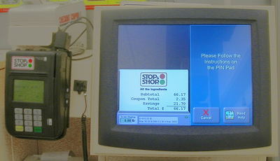
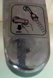
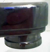
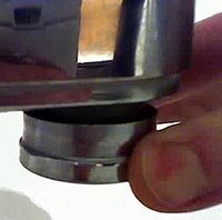
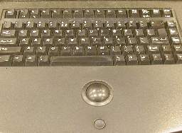
I’m not particularly fond of trackballs as pointing devices, but I can accept them. However, that teensy-weensy little Smartie-candy mouse button is awful. In most stores that I have visited, the button is not particularly functional, and you have to click on it fairly decisively in order to trigger it. That is a real face plant right there. You need to “wake up” just a bit in order to select a field. The concave design of the button aggravates this condition, as it is so deep that you may think the button has been pressed enough to work, when it has not been pressed far enough.


Face Plants:

The button is absolutely necessary for operation of the kiosk, yet has been made so small that it is non-intuitive, and hard to use.

The concave design of the button is too deep. The button is recessed into the counter top, so you need to press into the counter top, but the concavity in the top of the button makes this difficult. Basically, it is hard to click on things.

Suggested Solutions:

Make the mouse button larger.

Make the mouse button rise above the counter top slightly, and reduce the concavity.

I’m pretty sure the designers deliberately deprecated the mouse button because it was always accidentally being pressed. This would take some testing to get an acceptable shape.

Redesign the UI to eliminate the need for a mouse, and remove the pointing device.

Okay, I don’t like touchscreens, but that would be better than this.

Why I Don’t Like Touchscreens

This entry is part 9 of 14 in the series Usernotes

I had quite a sobering experience the other day at the supermarket.

Our supermarket has a neat feature at the deli counter. It’s a kiosk with a touchscreen that allows you to “pre-order” your deli order, then go about your business in the store. You come back later, and your order is ready. Very nice.

The kiosk works by presenting you with options, while lecturing you in a voice that reminds you of that particularly pedantic English teacher you had, back in 6th grade. The voice explains your options  S L O W L Y  and clearly. This means that you are at each screen for several seconds. It usually takes a couple of minutes to make an order.

Well, I made my order, went around and got the rest of my stuff, then came back to pick it up. It wasn’t yet ready, so I had to wait.

As I was waiting, I watched the people using the kiosk, because that’s what I do. I watch people use technology.

There was this one gentleman, and I’m sure that he was a gentleman, that completely altered my outlook on touchscreen technology forever. here’s why:

He seemed very nice. In his late forties or so. Well-dressed in a casual sort of way. Probably drove up in a Lexus or Mercedes (This isn’t a low-rent neighborhood. I’m the hoi polloi). He was making a deli order. Now, here’s the frightening part:

As he was waiting for each page to complete, he was absently picking his nose. With the same finger he was using to touch the screen.

Ugh.

To make matters worse, just before touching the screen, he would absently lick his finger, exactly as readers do before turning a page.

Double-Ugh.

I don’t know about you, but I’m not using that kiosk again. Maybe I need to wear latex gloves whenever I go shopping.

Truck Tires

This entry is part 10 of 14 in the series Usernotes

Last summer, they rebuilt the supermarket near my house. This involved knocking it all down, temporarily sending all the rodents over to my place, and then rebuilding a monster three times the size of the old one. This has been, for the most part, a rousing success, but I have noticed one sign of a rather poor planning process.

The loading docks are behind the supermarket, on the East side. Trucks generally come in off the main road that runs North of the supermarket, down a side road that runs East of the parking lot, into the East entrance. After that, they need to do a fair bit of jockeying to back into the loading bays. If anyone has ever seen an eighteen-wheeler back into a loading bay, they know that it is a pretty complex project, with many back-and-forth runs. They can also come in the West entrance, and come up behind the supermarket. In that case, this happens only when they leave.

Since the new supermarket is so huge, they had to substantially reduce the size of the parking lot. The trucks don’t have nearly the room to play with that they did with the previous lot. No problem. Truckers deal with this stuff all the time, you say. That’s why they get paid the big bucks.

Here’s the problem:

The Layout of the Parking Lot

The Layout of the Parking Lot
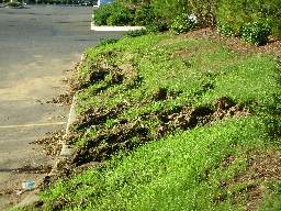
When they designed the parking lot, they underestimated the turning radius of the trucks, so the trucks are forced to go over the curb on the edge of the parking lot. This tears up the landscaping something fierce. After a good rain, the berm looks like a World War One battlefield (minus all the bodies). Those truck tires, and all that weight, are absolutely brutal. The problem, from this amatuer’s eye, seems to be that lampost island in the middle of the parking lot. It stands between the truck and the exit. It was obviously put there as part of a pattern. Maybe they were required to have these lights exactly that far apart by code, or maybe it was just a question of aesthetics. In either case, that torn-up grass is very ugly indeed.

Suggested Solutions:

Cut a “notch” out of the berm.

This is the easiest thing to do, but also the least effective. There would have to be a pretty big notch to accommodate all the trucks. You can bet that these drivers are going all out to avoid running over that landscaping, so you need more room than that represented by the tire tracks.

Reduce the width of the entire berm.

This would work, but it is likely to cause problems. For instance a big part of the job of that berm is to hide the loading bays from the houses across the street. If the same height was maintained for the berm, and it was made narrower, the chances are very good that it would erode.

Move the lampost further South, or further North.

As I said, there may be a town code or something that says the lamp needs to be a certain distance from the other lamps, but I’ll bet not. I think the designer just thought it looked good on his/her blueprints. To be fair, I don’t know if I would have figured this out, but I’m not a professional supermarket designer, and they are.

Remove the lampost island completely.

They could easily mount a floodlight on the building itself, or on a post further East.