“There’s always an easy solution to every human problem; Neat, plausible and wrong.”
H. L. Mencken

META: This is also posted on Medium
ROBERT FROST, I AM NOT
So I’m not even going to try to impress anyone with poitry. There’s the famous poem, where everyone thinks the poet celebrates individuality, bravely goes down “The Road Less Traveled By,” and gets all kinds of rewards for being an individualist.
Lotta folks think it’s sort of the opposite. The chap wanders down the “Road Less Traveled By,” and eventually wishes he’d followed the herd. That’s pretty much where I’m going with this post. Sorry. No inspirational TED talk here.
MOO
I’m gonna talk about donning a cowbell, and moving on with the rest of the herd; right down that old “Road Most Traveled By.”

When it comes to usability, it can be rather dangerous to take “The Road Less Traveled By,” and, in my experience, the great majority of us that are utterly convinced of our own genius (including Yours Truly) are…how shall I put this…dead f***ing wrong. We only manage to confuse our users, and damage our own work.
STORY TIME
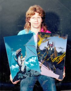 That hair was in style, back then.
Way back in The Dawn Time, I wanted to be an artist. I wasn’t half bad, but eventually grokked that a mediocre programmer has better prospects for eating regularly than even well-known artists (which, I suspect, was not going to be the case for me. I wasn’t that good).
In any case, I had an art teacher who was a fairly pithy and “salt of the Earth” chap. Not at all the artsy-fartsy, emotionally eloquent type of person you’d normally expect. No berets, Gitanes and turtlenecks for him.
I used to get all “sneery” about doing “cliché” art. I’d take a drag on my Gitane, adjust my beret, and make some asinine statement about how I wasn’t gonna follow his direction, because it was “cliché.”
He listened to this for a while, then made a simple statement I remember to this day (obviously):
“Things are cliché for a reason.”
He explained that things become cliché because as humans, we have “well-worn” paths in our psyches that respond well to predictable stimulus. If we will step off these “well-worn paths,” we need to do so carefully. If your goal is to make your work accessible and understandable, to reach out to a large number of folks, then it was pretty important to be “cliché.” Of course, if your goal is to alienate and offend a large number of folks, and maybe only “speak to” a small number of annoying folks like me (actually, “annoying folks” wasn’t exactly what he said), then, by all means, “express yourself” (I told you he was rather blunt).
PAVING THE BARE SPOTS
For many years, I have heard stories about some architect – they never say who – that once designed an office park/university campus/government center, etc., and deliberately did not add any paved walkways. Instead, it is said he had the buildings completely surrounded by lawns. After a year, he came back, and paved the areas of these lawns worn thin by people taking the most effective routes around the buildings.

He did this because he decided at the start of the project, he’d never be able to account for human nature, and it was his goal to serve the folks using the campus as best as he could. The users of his system would let him know, organically, how to “tune” it so it can best serve them.
I’ve never been able to verify this story, but it makes so much sense, it doesn’t seem to matter whether or not it’s true.
As it so happens, I have a story that dovetails very nicely into this…
STORY TIME (AGAIN…)
A bunch of years ago, they built a new bank building, in a nearby town. It was a TD Bank (like almost every new bank around these parts), and it was on the corner of a couple of fairly busy streets.
Like many of these projects, they set it up so access to the parking lot was highly restricted, and the parking lot was behind the bank building, itself.
It Seemed Like A Good Idea At the Time…
They originally designed it so people would use the new sidewalk to go from the parking lot, behind the building, around the side, to the front of the building, where the entrance was.
Human Nature Had Something to Say About That
However, people weren’t particularly interested in taking the long walk around the little lawn in front of the bank. They just cut right across it, with quite predictable results:

It was damn ugly (as you can see). The landscaper was probably having fits. Obviously, the situation could not be allowed to continue “as is.” At this point, the bank had a choice. They could fence off the lawn, forcing the customers to take the longer way ’round:

Image Alteration by Rose Pile Photography
Or they could take a lesson from that apocryphal architect:

Which they did (That last image is the one that shows what it looks like today).
You see, all those “vandals” that were “damaging the property” were what is known as “customers.” True, they were damaging the lawn, but part of the reason is they were weighed down by ALL THE MONEY THEY WERE BRINGING INTO THE BANK. It was in the bank’s best interest TO MAKE IT EASIER FOR CUSTOMERS TO BRING MONEY INTO THE BANK.
That makes sense, doesn’t it? By walking across the lawn, the customers made it plain they preferred an accelerated journey TO BRING THEIR MONEY INTO THE BANK.
That seems like a “no-brainer,” huh? Of course we make it easier to get customers to give us their money. Amazon has it down to a science.
Yet software designers are regularly choosing to erect fences, instead of paving paths. This has certainly been the case in my experience. It was definitely true for me, until I read this book. Then everything changed. But that’s another story, for another day…
TRUE USABILITY IS ORGANIC (AND CHAOTIC)
Usability isn’t something that always “makes sense.” It’s based on decisions, made by these organic beings, known as “people.”
People make decisions based on all kinds of factors. If they are right-handed, then the right side of the screen is often the best place to put buttons and click targets. They may have color combinations that appeal to them, and these could be related to things like nationality or ethnicity. Whether they are male or female could make a huge difference in how they interpret content and navigation. Age and education level. Whether they live in an urban or rural area, etc. The list could go on forever, and is obviously so dense it would take a supercomputer to predict things.
Lacking a supercomputer, we need to rely on more primitive (and, in my opinion, effective) means, like A/B Testing, heatmap testing, and just plain old “paying attention to how the users work with your software,” which can involve on-site visits, user testing (not as effective as you might think), even surveys.
A lot of software development and Web-based systems allow you to embed metrics packages (like Google Analytics) into them, which can give you a great deal of information about how users view and use your software.
USABILITY IS REACTIVE; NOT PROACTIVE
“No battle plan ever survives first contact with the enemy.”
-Helmuth von Moltke
I’m pretty experienced at what I do, so there’s a number of “no brainers” that inform my work. I can produce some pretty darn usable software, right out of the starting gate. However, I have yet to produce anything “perfect” from the git-go. EVERYTHING I design has problems in the 1.0 version. I can use quality engineering techniques to reduce the likelihood of actual bugs, but I don’t think I’ve ever been particularly successful at fully predicting how my software will actually be used. I’m constantly surprised.
That’s why it’s so important for me to reduce the “concrete galoshes” in my software. The specs (especially the graphical design and interaction specs) need to be flexible enough to change fairly rapidly. I have to swallow my pride. I’m likely to be embarrassed by some of the assumptions and mistakes I’ll make.
For example, technical writing is a skill at which I’m only mediocre. A really good tech writer can make documentation fun to read. They can produce something users actually proactively peruse, instead of waiting until things go pear-shaped before taking the shrink-wrap off the manual.
I’ve written a great deal of documentation over my career. Some of it has been pretty good. Some, on the other hand, I can’t even use as catbox liner, because the little fuzzballs won’t even pee on it.
I can tell when my documentation is bad, because I get a lot of questions about stuff that’s in the documentation.
A lot of folks I know call this PEBCAK, and sneer at the users. They like to say “RTFM!“
IT’S ALL MY FAULT
I take a different tack. Many users I know don’t like to ask for help. If they contact me, it’s often a somewhat emotionally-loaded and embarrassing event. I need to take that into account when I deal with them, and it starts by immediately accepting blame for the issue; WHATEVER THE ISSUE IS, EVEN “PEBCAK.” If they don’t have an answer that is in the documentation, for whatever reason, even if they didn’t read the manual, IT’S MY FAULT.
There. That simplifies things. If it’s my fault, then I can do something about it. If it’s the users’ fault; there ain’t a damn thing I can do about it. I mean, seriously. Think about it. Why deride the users? What do I want? Do I want them to go away and stop giving me money? Am I looking for “extra snotty” users who will “understand me” better (and will probably be penultimate pains in the butt)? Seriously? Am I allergic to money, or something?
NEGATIVE FEEDBACK IS INCREDIBLY VALUABLE
It can be mighty unpleasant to read negative reviews and comments about our work, but it’s worth it to do so, as long as we’re doing it to improve said work. I often say that positive affirmations feel good, but negative feedback is required to improve a product. Negative feedback, even if it’s uncouth diatribes from unpleasant people, is far more valuable than the most glowing praise (unless said “glowing praise” comes from Consumer Reports).
Simply put, negative feedback is a goldmine. DON’T WASTE IT. Steel yourself. Take a belt of absinthe, if you need, and open the “Comments” section. Read everything. It sucks, doesn’t it? Is that even physically possible? Don’t you wish you were in good enough shape to do it? Do you remember your mother ever saying anything that could indicate this were true? Wait. What was that they said about the communication error report alert?
USABILITY -AND RESPECT- HITS THE BOTTOM LINE
Some of the least computer-savvy people I’ve ever met are doctors and lawyers.
Let me repeat that: Some of the least computer-savvy people I’ve ever met are doctors and lawyers.
Think about that. These folks are NOT dumb. They have better educations than most of us, and often make more money than we do. They have forgotten more stuff, about arcane, abstract concepts way beyond our ken, than we will ever know. Society obviously values them, and shows it by paying them extremely well.
They deserve our respect; especially if they are our customers. If they can’t use our products, then we have a problem. They may get marginally annoyed, by having to take all that money they make, and giving it to one of our competitors instead of us, but we are the ones that will get it in the shorts.
That means that we need to start with a baseline of fundamental respect for our users when we design our systems. We need to have empathy and we need to feel an emotional bond (admittedly, this can be quite difficult with some users, but we need to shove our egos back into the kennel, and be nice). If they don’t read the manual, then what can we do to make the manual more appealing, or what can we do to obviate the manual? This could entail things like opening our wallets, and contracting a good tech writer to redo our manuals, or a Web designer to make our online documentation more usable. It could also mean we need to refactor our designs, so the affordances are more obvious.
OWN THE EXPERIENCE
The basic gist is WE NEED TO “OWN” THE ENTIRE USER EXPERIENCE OF OUR PRODUCT.
“User Experience” is a lot more than just the buttons and screens on our software. It’s the documentation, the Web site, the marketing materials (even the stupid bobblehead dolls they give as tchotchkes at trade shows). It’s the customer support. It’s the speech the CEO gives on TED Talks. It’s the comments and unofficial feedback and “buzz.”
In short, IT’S EVERYTHING ABOUT OUR PRODUCT, and we need to own as much of it as possible.
USER EXPERIENCE IS A CONTINUUM
Often because of corporate structure and politics, companies tend to break up the various components of their user experience. Sometimes, these components actually compete with each other, or overlap their work.
That needs to stop. Even if the corporate structure is balkanized, we need to find a way to bridge the curation of the User Experience. For example, say the company hires a “strategy boutique” to deliver revamped corporate branding. That needs to be reflected EVERYWHERE (not just in the Marketing Department). If the software has so many concrete galoshes we can’t come out with a new version of the app with simple color and logo changes, we’ve got lots of problems.
WE NEED A “UX CZAR”
It’s pretty important to have someone (usually, a single “someone”) who is responsible for managing the entire User Experience. They need to have a fair amount of power, and they need to have a keen sense of UX.


This is fairly rare. I think one of the reasons is people who are good at this stuff often have personalities that make it difficult to climb corporate ladders, so they don’t end up with that requisite power. The ones who do make it, often start in that position (Think Steve Jobs or Walt Disney). It’s rare to have the combination of power and connection to the UX you’ll find in people like that. They have a nasty habit of speaking their mind, and they aren’t always known for choosing their words carefully.
That means we probably don’t want to look in the usual “yes man pool” for these folks. Also, we shouldn’t appoint someone just because they’re an autocratic, perfectionist jerk (there’s plenty of them around). We need someone who is “married to the art,” and usually makes good UX decisions. Those folks don’t grow on trees. If we put an autocratic, perfectionist, uncreative jerk in charge of our UX, we’ll be very, very sorry.
MISTAKES ARE GOOD
“Good Judgment comes from experience. Experience comes from bad judgment.”
-Attributed to Nasrudin
Some of my most valuable life lessons have come from disasters.
I’ve made a LOT of mistakes in my lifetime. Some, extremely embarrassing.
I have a fairly big list of “bad judgments” in the UX arena. Did I mention that I used to be an artist? I thought that gave me “artistic license” to inflict my “vision” onto users. In fact, some of the very first projects that I did on the Mac were “CDEF” projects (custom controls -pretty high geek-factor projects, at the time). These were sliders and buttons that deviated from the Apple standards. I was unsatisfied with what Apple provided, and decided I knew better.
These days, I pretty much stick to the standards. I’ve learned some humbling lessons.
As I’ve pointed out above, effective UX often comes about from “running something up the flagpole, and seeing who salutes.” True visionaries can RARELY come up with ideas that “push the envelope.”
RARELY
Have you ever heard of “Kai’s Power Tools”?
Anyone?
Bueller?
There’s a reason for that. KPT was a collection of special effects image processing filters for Adobe Photoshop; known for an innovative and beautiful user interface. Kai’s Power Tools Fizzled.
It was a “visionary” interface. Kai Krause is a German UI designer that has a really wild graphical style. His stuff is pretty much awesome. As an artist, I thought his work was far better than the standard Apple and Adobe stuff.
And damn near unusable. It had all these odd “skeuomorphic” balls and knobs that you couldn’t figure out if you clicked on them or dragged them (very often; both). It also had a MASSIVE disk space and memory footprint. He practically had to write his own operating system to run those whacky controls.
Probably the most famous of his filters was Kai’s Power Goo. I think that Sketcher’s did a whole advertising campaign based on that filter, once.
There were also a couple of really neat 3D programs, like Bryce (the 3D landscape generator. At one time Bryce-generated landscapes dominated the Web).
I do miss KPT, but completely understand why it fell down.
HEDGE YOUR BETS
Remember what I mentioned at the beginning about “dead wrong”? Also, even Steve Jobs made lots of [apparent] mistakes as he was navigating life. The NeXT Cube was often considered a commercial flop, yet it gave us the operating system that drives the iPhone – one of the most successful products in history (Whenever you see a Core OS function that begins with “NS,” you are using an original NeXT function).
“If I’d asked customers what they wanted, they would have told me, ‘A faster horse!'”
-Henry Ford
I’m not saying “Don’t innovate.” I’m saying “Innovate intelligently.” If I take risks, I need to UNDERSTAND I’m taking a risk. Just because I think it’s a good idea doesn’t actually make it a good idea.
That means I might want to consider reviewing what I already have, and how it’s used, to see if my “great idea” has “legs.” I need to spend some time thinking about the user; getting into their shoes. Looking at my work through THEIR eyes, and ignoring my own bias (which can sometimes be next to impossible).
I need to try to connect with the people who use my work, and see what they think. It’s usually not a good idea to ask a user “What do you want?” as guidance for new stuff, as this won’t give me guidance for future directions.
Instead, ask them “What do you want to do?”. Don’t couch it in terms of OUR work. We should look at what THEY want to do, in terms of THEIR work, and see if that switches on any light bulbs.
CONCLUSION
In conclusion, it’s a really good idea to take “The Road Most Traveled By.” We should value our users, warts and all. We should give them what they want and expect, and not use them as guinea pigs for our experiments. We should listen to their whining and kvetching. We should unify our UX, and keep surprises to a minimum.
We should realize there’s a difference between “risk-taking” and “recklessness.” We need to appreciate that UX is SERIOUS STUFF that can have significant impact (both good and bad) on the bottom line of our work.
If we do this, we’re unlikely to regret it.