ABSTRACT
Floating elements are a useful and often misused CSS capability. They allow images or other types of content to be positioned so that they are always to the right or left of the content text, and allow the text to flow around them.
THE BASICS
Any block-level element can be assigned a float property. This will govern how it will behave with its peers (but not its containers or contained elements).
The float property has three possible values: “left”, “right” or “none”.
What is a Float?
What the float property does is to “detach” the element to which it is applied, and shove it over to the upper left or upper right of the container element. If the container also contains text, then the text will “flow” around the floated element. Otherwise, the floated element is “on its own.” There are a few ramifications to floats, and I’ll cover them in just a bit.
First, however, let’s look at some examples:
This is with no float property applied to any element:
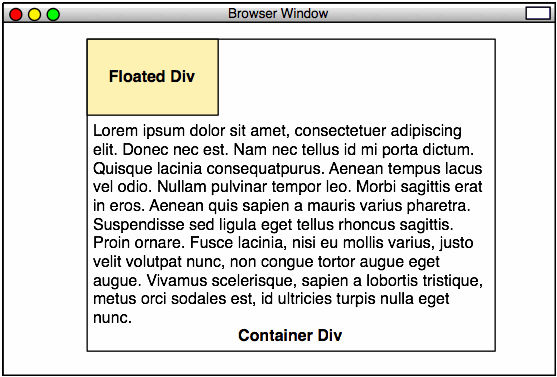
Intermediate CSS-Based Design, Example 24
Here is the code for that file:
<!DOCTYPE html PUBLIC "-//W3C//DTD XHTML 1.0 Strict//EN"
        "http://www.w3.org/TR/xhtml1/DTD/xhtml1-strict.dtd">
<html xmlns="http://www.w3.org/1999/xhtml" xml:lang="en" lang="en">
	<head>
		<meta http-equiv="content-type" content="text/html; charset=utf-8" />
		<title>Example 24</title>
		<style type="text/css">
			* {
				margin:0;
				padding:0;
			}
			html,
			body {
				width:100%;
				height:100%;
				text-align: center;
			}
			.main_container {
				width: 500px;
				margin-left:auto;
				margin-right:auto;
				text-align:left;
				border:1px solid black;
				padding:8px;
			}
			.floated_container {
				width:140px;
				padding:4px;
				background-color:#ffc;
				border:1px solid red;
			}
		</style>
	</head>
		<div class="main_container">
			<div class="floated_container">
				This text is in a container that is a peer to the text in the main container.
			</div>
			Lorem ipsum dolor sit amet, consectetuer adipiscing elit. Donec nec est. Nam nec
			tellus id mi porta dictum. Quisque lacinia consequat purus. Aenean tempus lac
			us vel odio. Nullam pulvinar tempor leo. Morbi sagittis erat in eros. Aen
			ean quis sapien a mauris varius pharetra. Suspendisse sed ligula eget tel
			lus rhoncus sagittis. Proin ornare. Fusce lacinia, nisi eu mollis varius, jus
			to velit volutpat nunc, non congue tortor augue eget augue. Vivamus sce
			lerisque, sapien a lobortis tristique, metus orci sodales est, id ultricies tur
			pis nulla eget nunc. Aenean hendrerit pellentesque nunc. Aenean tempor sol
			licitudin tortor. Proin sit amet felis vitae erat interdum blandit. Integer pha
			retra, ligula at ullamcorper vulputate, nisl urna faucibus risus, eu tempus est
			 elit ac nulla. Ut viverra quam sit amet purus. Morbi luctus arcu at dolor. Dui
			s et mi quis nulla vehicula auctor. Etiam tempor, velit eu ultricies iac
			ulis, leo massa ullamcorper ipsum, in iaculis risus tellus a justo. Quisque bib
			endum. Curabitur eget lorem. Mauris vel augue eu justo congue vulputate. Sus
			pendisse elit nisi, elementum eu, rutrum non, facilisis at, risus. Maecenas tri
			stique feugiat est. Donec consequat lacinia sapien. Sed varius diam feugiat mau
			ris. Praesent ante leo, blandit ut, commodo sed, euismod eu, urna. In pede. Pel
			lentesque rutrum. Nulla facilisi. Pellentesque consequat magna eu nibh. Pel
			lentesque velit.
		</div>
	</body>
</html>
This is with a float property with a value of “left,” applied to the small, internal box:
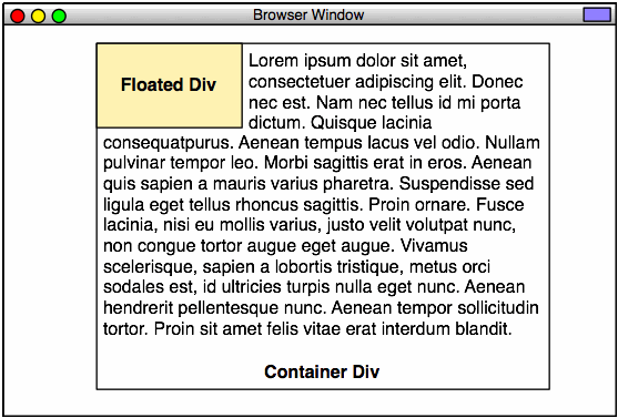
Intermediate CSS-Based Design, Example 25
The CSS for that file:
.floated_container {
	float:left;
	width:140px;
	padding:4px;
	background-color:#ffc;
	border:1px solid red;
}
However, notice that the text jams right up against the right side of the floated box. This is [one of] the annoying thing[s] about using floats. The container’s padding is applied to the floated element, and there’s none left over for the text that flows around it. In order to resolve this, we need to add an 8-pixel margin (not padding) to the right side only of the floated element:
Intermediate CSS-Based Design, Example 26
The CSS for that file:
.floated_container {
	float:left;
	width:140px;
	padding:4px;
	margin-right:8px;
	background-color:#ffc;
	border:1px solid red;
}
You can also have the block element floated to the right side of the container, by applying a float: right value:
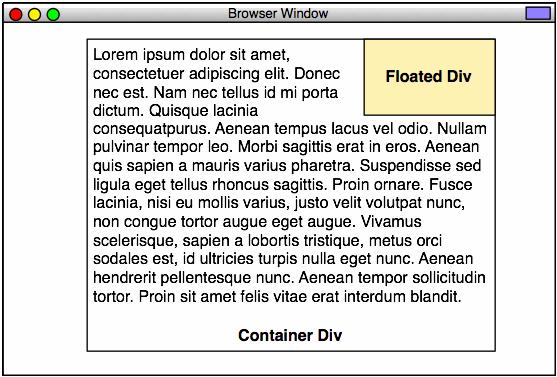
Intermediate CSS-Based Design, Example 27
The CSS for that file:
.floated_container {
	float:right;
	width:140px;
	padding:4px;
	margin-left:8px;
	background-color:#ffc;
	border:1px solid red;
}
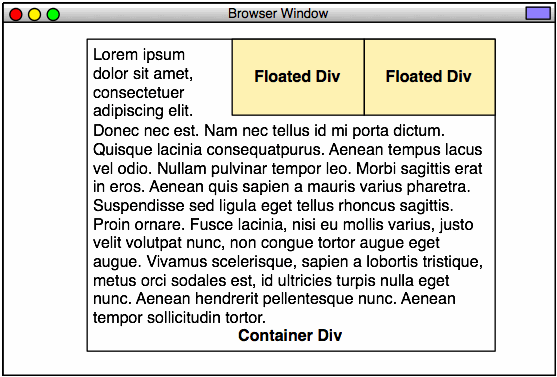
Directly Adjacent Floated Elements
Now, things get interesting. When you float multiple successive block elements, watch what happens:
Intermediate CSS-Based Design, Example 28
Here’s the code for Example 28:
<!DOCTYPE html PUBLIC "-//W3C//DTD XHTML 1.0 Strict//EN"
        "http://www.w3.org/TR/xhtml1/DTD/xhtml1-strict.dtd">
<html xmlns="http://www.w3.org/1999/xhtml" xml:lang="en" lang="en">
	<head>
		<meta http-equiv="content-type" content="text/html; charset=utf-8" />
		<title>Example 28</title>
		<style type="text/css">
			* {
				margin:0;
				padding:0;
			}
			html,
			body {
				width:100%;
				height:100%;
				text-align: center;
			}
			.main_container {
				width: 500px;
				margin-left:auto;
				margin-right:auto;
				text-align:left;
				border:1px solid black;
				padding:8px;
			}
			.floated_container1 {
				float:right;
				width:140px;
				padding:4px;
				background-color:#ffc;
				border:1px solid red;
			}
			.floated_container2 {
				float:right;
				width:140px;
				padding:4px;
				margin-left:8px;
				background-color:#ffc;
				border:1px solid red;
			}
		</style>
	</head>
		<div class="main_container">
			<div class="floated_container1">
				This text is in a container that is a peer to the text in the main container. This
				container will be located all the way to the right.
			</div>
			<div class="floated_container2">
				This text is in a container that is a peer to the text in the main container. This
				container will be just to the left of the first container.
			</div>
			Lorem ipsum dolor sit amet, consectetuer adipiscing elit. Donec nec est. Nam nec
			tellus id mi porta dictum. Quisque lacinia consequat purus. Aenean tempus lac
			us vel odio. Nullam pulvinar tempor leo. Morbi sagittis erat in eros. Aen
			ean quis sapien a mauris varius pharetra. Suspendisse sed ligula eget tel
			lus rhoncus sagittis. Proin ornare. Fusce lacinia, nisi eu mollis varius, jus
			to velit volutpat nunc, non congue tortor augue eget augue. Vivamus sce
			lerisque, sapien a lobortis tristique, metus orci sodales est, id ultricies tur
			pis nulla eget nunc. Aenean hendrerit pellentesque nunc. Aenean tempor sol
			licitudin tortor. Proin sit amet felis vitae erat interdum blandit. Integer pha
			retra, ligula at ullamcorper vulputate, nisl urna faucibus risus, eu tempus est
			 elit ac nulla. Ut viverra quam sit amet purus. Morbi luctus arcu at dolor. Dui
			s et mi quis nulla vehicula auctor. Etiam tempor, velit eu ultricies iac
			ulis, leo massa ullamcorper ipsum, in iaculis risus tellus a justo. Quisque bib
			endum. Curabitur eget lorem. Mauris vel augue eu justo congue vulputate. Sus
			pendisse elit nisi, elementum eu, rutrum non, facilisis at, risus. Maecenas tri
			stique feugiat est. Donec consequat lacinia sapien. Sed varius diam feugiat mau
			ris. Praesent ante leo, blandit ut, commodo sed, euismod eu, urna. In pede. Pel
			lentesque rutrum. Nulla facilisi. Pellentesque consequat magna eu nibh. Pel
			lentesque velit.
		</div>
	<body>
	</body>
</html>
Now, one thing we get used to with markup, is that everything goes from left to right. You’d expect the floated_container2 <div> to be to the right of the floated_container1 <div>, as it occurs after that element. However, with floated elements, the rules change slightly. The first element to be floated is put in place first, followed by the second element. If the float is on the right side, then the first element is set to the right of the next element.
Adjoined floated block elements are used extensively in navigation menus. You’ll see them everywhere. The most common form is actually usually left-floated:
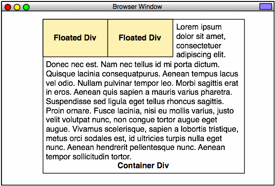
Intermediate CSS-Based Design, Example 29
In this case, the order of the elements is about what you’d expect.
.floated_container1 {
	float:left;
	width:140px;
	padding:4px;
	background-color:#ffc;
	border:1px solid red;
}
.floated_container2 {
	float:left;
	width:140px;
	padding:4px;
	margin-right:8px;
	background-color:#ffc;
	border:1px solid red;
}
You can also float the block elements on either side of the container:
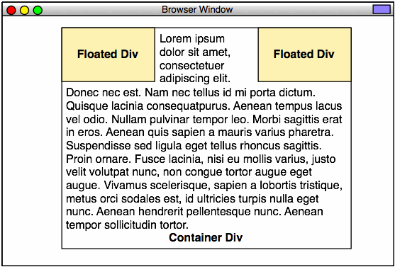
Intermediate CSS-Based Design, Example 30
In the next section, we’ll start talking about using the clear CSS property.