ABSTRACT
One of the most powerful things that you can do with CSS control of block elements is position elements anywhere you want on the screen. If you learn to use the CSS position properties properly, you can do some really neat stuff.
THE BASICS
For this post, I’ll only discuss display property values of “block” and “table.” There are a few more display values, but they are not commonly used, and belong in a more advanced discussion.
First of all, we need to realize that inline elements can’t be positioned. Only block-level elements and tables can be positioned. For the examples in this page, I’ll use <div> elements. See my previous posting on block-level and inline elements to get a quick idea of what the difference is.
The Position Property
The operating theory of the position property is actually very simple: Just put the darn thing somewhere on the page (or in the window). In practice, this doesn’t always come out the way we think it should, so we should understand how it all works.
The position property sets up the element to be positioned using the left, top, bottom and right position specifier properties.
The position property has four possible values (remember that these only apply to block elements or tables):
- static
- This is the default value of an element’s position property. You can’t make positional changes to elements with a static value. The browser will put the element where it wants. The position specifiers are ignored.
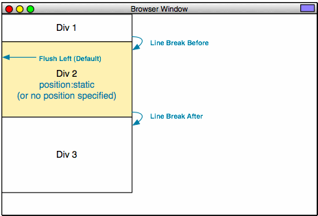
- Example 9 (Static Position)
- Example 10 (Note that the left property is being ignored.)
- relative
- This is like static, but with the ability to change the position. This means that any position information will be relative to where the element would be drawn if it were static.
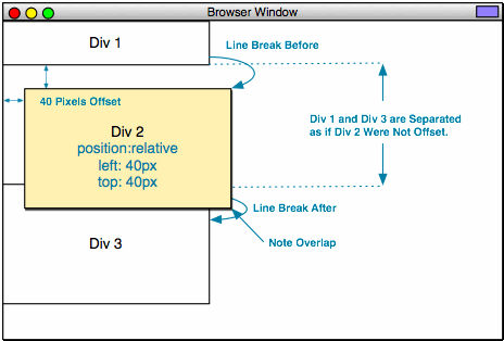
- Example 11 (Relative Position, Indented 40 Pixels on the Left.)
- Example 12 (Relative Position, Indented 40 Pixels on the Left, and on the Top.)
- Example 13 (Relative Position, Indented 40 Pixels on the Left, and on the Top, but Div 2 is Much Smaller. Note the Space Between Div 1 and Div 3 is Now Much Smaller as Well.)
- absolute
- This one gets used a lot. It specifies that an element is always at a specific place within its containing element. This value also has the effect of “decoupling” an element from its context, like the float property does (We’ll cover float a bit later).
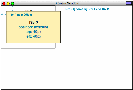
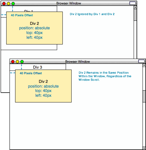
- Example 14 (Absolute Position, Indented 40 Pixels on the Left, and on the Top. Note that Div 3 Immediately Follows Div 1 as if Div 2 were not Present, and that Div 2 Scrolls with the Page.)
- fixed
- This is like absolute, but in relation to the page itself, not the container. Elements given a fixed value don’t move in the window at all. It is very useful, except that it doesn’t work in Microsoft Internet Explorer 6. That alone, renders the value almost worthless for all practical purposes.
- Example 15 (Fixed Position, Indented 40 Pixels on the Left, and on the Top. Note that Div 3 Immediately Follows Div 1 as if Div 2 were not Present, and that Div 2 Does not Scroll with the Page.)
- NOTE: Example 15 will not work for Microsoft Internet Explorer 5 or 6!
Okay, let’s look at the code for some of the above examples.
<!DOCTYPE html PUBLIC "-//W3C//DTD XHTML 1.0 Strict//EN"
        "http://www.w3.org/TR/xhtml1/DTD/xhtml1-strict.dtd">
<html xmlns="http://www.w3.org/1999/xhtml" xml:lang="en" lang="en">
	<head>
		<meta http-equiv="content-type" content="text/html; charset=utf-8" />
		<title>Example 9</title>
		<style type="text/css">
			* {
				margin:0;
				padding:0;
			}
			html,
			body {
				width:100%;
				height:100%;
			}
			#div1,
			#div2,
			#div3 {
				border: 1px solid black;
				width:300px;
				height:200px;
				text-align:center;
				line-height: 200px;
			}
			#div2 {
				background-color: #ffc;
			}
			#div2 {
				position:static;
			}
		</style>
	</head>
	<body>
		<div id="div1">DIV 1</div>
		<div id="div2">DIV 2</div>
		<div id="div3">DIV 3</div>
	</body>
</html>
Before we start, I want to go over three habits that I highly recommend you develop:
- ALWAYS specify a DOCTYPE (
<!DOCTYPE html PUBLIC "-//W3C//DTD XHTML 1.0 Strict//EN")! This ensures consistent behavior across a range of browsers. It tells the browser what to expect.
"http://www.w3.org/TR/xhtml1/DTD/xhtml1-strict.dtd"> - ALWAYS specify a default class with margins and padding zeroed out.
			* {
				margin:0;
				padding:0;
			}
This ensures that you have a "blank slate" for every element. It is strong enough to override the inherent properties of elements that have margins or padding (like <p> or <ol> elements).
- ALWAYS explicitly specify your <html> and <body> height and width.
			html,
			body {
				width:100%;
				height:100%;
			}
Some browsers (most notably, Microsoft Internet Explorer 6) will not actually expand these to fill the window, which can lead to strange page renderings. This ensures that the entire window is filled.
In the above example code, we want to look at that last style rule:
			#div2 {
				position:static;
			}
Remember that static is the default position property value, so, in the example above, there would be no difference between position:static and nothing specified for the position property.
In example 10, we specify a left:40px property, but it is ignored, as the position property value is static:
			#div2 {
				position:static;
				left:40px;
			}
In example 11, we also specify a left:40px property, but this time, is is not ignored, as the position property value is now relative:
			#div2 {
				position:relative;
				left:40px;
			}
In example 12, we simply added a top positioning value to the mix, forcing an overlap:
			#div2 {
				position:relative;
				left:40px;
				top:40px;
			}
In example 13, we shrunk Div 2, in order to demonstrate that the surrounding <div> elements are acting as if the <div> being positioned was still in its static place:
			#div2 {
				position:relative;
				height:100px;
				line-height: 100px;
				left:40px;
				top:40px;
			}
In example 14 and example 15, we actually stretch the window, in order to force a vertical scroll:
			html {
				width:100%;
				height:100%;
			}
			body {
				width:100%;
				height:150%;
			}
In example 14, we set the position value to absolute. Remember that the containing element for Div 2 is the <body> element:
			#div2 {
				position:absolute;
				left:40px;
				top:40px;
			}
In example 15, we set the position value to fixed. Remember that this will not work for Microsoft Internet Explorer 5 or 6:
			#div2 {
				position:fixed;
				left:40px;
				top:40px;
			}
Bottom and Right Offsets
Now, I’ve shown you how the top and left position specifiers work, but you can also specify the position from the bottom or the right. The rules followed are pretty similar to those followed by the margin property: The offset is the distance to the side of the element from the corresponding side of its container. This is something that you need to keep in mind.
Watch what happens when we use the top and bottom as offset parameters in our relative position example:
			#div2 {
				position:relative;
				right:40px;
				bottom:40px;
			}
Now, we’ll do the same for absolute positioning:
			#div2 {
				position:absolute;
				right:40px;
				bottom:40px;
			}
In example 18, we’ll force the window to scroll. Pay attention to how the positioned element is placed. It is placed 40 pixels in from the bottom, right of the window, which, in this case, is acting as the container, instead of the <body> element. This is a slight variation from the rule that absolute positioning is based on the container. The reason for this is that the <body> element, even though it is specified at 150%, is effectively cut off by its container, which is the <html> element, and its container, which is the document window. The reasons for all this are a bit much to go into, but suffice it to say, that, as long as the <html> element is set to 100%, absolute positioned elements contained by the <body> element will always position in reference to the display window.
Look at example 19 to see what happens when the <html> element is set to 150%, instead of the <body> element.
Look at example 20 to see how the fixed position works when offset from the bottom, right corner of the window. Again, the same disclaimer goes here: This will not work for Microsoft Internet Explorer 5 or 6.
Messing With the Width and Height
One last item before we go on. This also applies to margins, but can cause problems with positioned elements.
Look at the code for example 21:
			#div2 {
				position:absolute;
				left:40px;
				right:40px;
				bottom:40px;
			}
You would think that, if you specify both a right and a left, the element would stretch to fill the space from 40 pixels in on the left, to 40 pixels in on the right. It does not. So, the problem must be that the width property, defined in the main CSS, is causing the element to remain fixed. It also appears that the left position specifier has greater weight (specificity?) than the right.
Let’s override the width, and set it to “auto,” which is whatever the browser wants to do:
			#div2 {
				position:absolute;
				left:40px;
				right:40px;
				bottom:40px;
				width:auto;
			}
If you looked at it in Firefox, it looked exactly as you would expect. However, if you looked at it in Microsoft Internet Explorer 6, it was all smushed over to the left.
Basically, when positioning things, only specify one side of any given axis (either left or right; either top or bottom), and rely on the width and height properties to set the element dimensions.
Next, we’ll discuss the CSS float properties.