ABSTRACT
The clear property tells the browser to make sure that the element with the clear property applied, gets put under an element with a float property applied. However, you can make a clear property react only to elements floated on the left, or on the right (or either one).
THE BASICS
The clear property has four possible values: “none”, “left”, “right” and “both”. It is described as “Set the side of an element where other elements are not allowed.” Like the float property, it can only be applied to block-level elements. It also is useful when used in conjunction with floated elements.
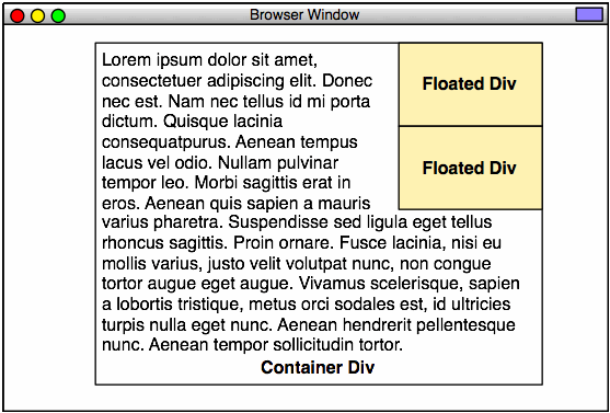
This is almost exactly the same as example 28, but with the addition of the clear property applied to the second floated <div>:
Here is the code for relevant CSS for that file:
.floated_container1 {
	float:right;
	width:140px;
	padding:4px;
	margin-left:8px;
	background-color:#ffc;
	border:1px solid red;
}
.floated_container2 {
	float:right;
	width:140px;
	padding:4px;
	margin-left:8px;
	background-color:#ffc;
	border:1px solid red;
	clear:right;
}
Adding that “clear:right” told the second element “go under the previous right-floated element.” The “clear:right” means that it will only go under right-floated elements. Watch what happens if we change the “clear:right” to “clear:left”:

It did not clear, and, to add insult to injury, it was separated by the left margin on the first element.
Let’s go back to the original, and separate the two <div> elements:
.floated_container2 {
	float:right;
	width:140px;
	padding:4px;
	margin-top:8px;
	margin-left:8px;
	background-color:#ffc;
	border:1px solid red;
	clear:right;
}
However, if we float them both left, the clear:left works as expected:

.floated_container1 {
	float:left;
	width:140px;
	padding:4px;
	margin-right:8px;
	background-color:#ffc;
	border:1px solid red;
}
.floated_container2 {
	float:left;
	width:140px;
	padding:4px;
	margin-top:8px;
	margin-right:8px;
	background-color:#ffc;
	border:1px solid red;
	clear:left;
}
Now, why would we want to only clear on one side? Why not do both all the time?
Here’s why:

.floated_container0 {
	float:left;
	width:140px;
	padding:4px;
	margin-right:8px;
	background-color:#ffc;
	border:1px solid red;
}
.floated_container1 {
	float:right;
	width:140px;
	padding:4px;
	margin-left:8px;
	background-color:#ffc;
	border:1px solid red;
}
.floated_container2 {
	float:left;
	width:140px;
	padding:4px;
	margin-top:8px;
	margin-right:8px;
	background-color:#ffc;
	border:1px solid red;
	clear:left;
}
You can remove the right container, and nothing changes on the left:
.floated_container0 {
	float:left;
	width:140px;
	padding:4px;
	margin-right:8px;
	background-color:#ffc;
	border:1px solid red;
}
.floated_container2 {
	float:left;
	width:140px;
	padding:4px;
	margin-top:8px;
	margin-right:8px;
	background-color:#ffc;
	border:1px solid red;
	clear:left;
}
You can have a similar arrangement, right-justified:
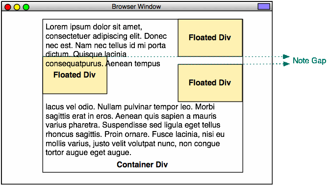
However, the order of things becomes important. Look at what happens here (NOTE: This will only happen on some browsers, most notably: Mozilla Firefox):
Here’s the code for Example 38. See if you can figure out what the problem is:
<!DOCTYPE html PUBLIC "-//W3C//DTD XHTML 1.0 Strict//EN"
        "http://www.w3.org/TR/xhtml1/DTD/xhtml1-strict.dtd">
<html xmlns="http://www.w3.org/1999/xhtml" xml:lang="en" lang="en">
	<head>
		<meta http-equiv="content-type" content="text/html; charset=utf-8" />
		<title>Example 38</title>
		<style type="text/css">
			* {
				margin:0;
				padding:0;
			}
			html,
			body {
				width:100%;
				height:100%;
				text-align: center;
			}
			.main_container {
				width: 500px;
				margin-left:auto;
				margin-right:auto;
				text-align:left;
				border:1px solid black;
				padding:8px;
			}
			.floated_container0 {
				float:left;
				width:140px;
				padding:4px;
				margin-right:8px;
				background-color:#ffc;
				border:1px solid red;
			}
			.floated_container1 {
				float:right;
				width:140px;
				padding:4px;
				margin-left:8px;
				background-color:#ffc;
				border:1px solid red;
			}
			.floated_container2 {
				float:right;
				width:140px;
				padding:4px;
				margin-top:8px;
				margin-left:8px;
				background-color:#ffc;
				border:1px solid red;
				clear:right;
			}
		</style>
	</head>
		<div class="main_container">
			<div class="floated_container1">
				This text is in a container that is a peer to the text in the main
				container. This container will be located all the way to the right.
			</div>
			<div class="floated_container2">
				This text is in a container that is a peer to the text in the main
				container. This container will be located all the way to the right, but
				directly below the first one, separated by 8 pixels.
			</div>
			<div class="floated_container0">
				This text is in a container that is a peer to the text in the main
				container. This container will be located all the way to the left.
			</div>
			Lorem ipsum dolor sit amet, consectetuer adipiscing elit. Donec nec est. Nam
			nec tellus id mi porta dictum. Quisque lacinia consequat purus. Aenean tempus
			lacus vel odio. Nullam pulvinar tempor leo. Morbi sagittis erat in eros.
			Aenean quis sapien a mauris varius pharetra. Suspendisse sed ligula eget
			tellus rhoncus sagittis. Proin ornare. Fusce lacinia, nisi eu mollis varius,
			justo velit volutpat nunc, non congue tortor augue eget augue. Vivamus
			scelerisque, sapien a lobortis tristique, metus orci sodales est, id ultricies
			turpis nulla eget nunc. Aenean hendrerit pellentesque nunc. Aenean tempor
			sollicitudin tortor. Proin sit amet felis vitae erat interdum blandit. Integer
			pharetra, ligula at ullamcorper vulputate, nisl urna faucibus risus, eu tempus
			est elit ac nulla. Ut viverra quam sit amet purus. Morbi luctus arcu at dolor.
			Duis et mi quis nulla vehicula auctor. Etiam tempor, velit eu ultricies
			iaculis, leo massa ullamcorper ipsum, in iaculis risus tellus a justo. Quisque
			bibendum. Curabitur eget lorem. Mauris vel augue eu justo congue vulputate.
			Suspendisse elit nisi, elementum eu, rutrum non, facilisis at, risus. Maecenas
			tristique feugiat est. Donec consequat lacinia sapien. Sed varius diam feugiat
			mauris. Praesent ante leo, blandit ut, commodo sed, euismod eu, urna. In pede.
			Pellentesque rutrum. Nulla facilisi. Pellentesque consequat magna eu nibh.
			Pellentesque velit.
		</div>
	<body>
	</body>
</html>
Here’s what happened. We moved floated_container_0 to the end of the line, and then told it to float:left, so it will do so. However, it is affected by the clear:right property in the second right-floated element. This means that its top is at the level of the bottom of the first right-floated element, as that is where the second element’s clear sets the bar. Notice that it interferes with the text display. The text does not flow properly around it. This will not happen in all browsers. Some browsers will add an implicit margin to the left-floated element, and the text will flow properly.
The margin-top:8px; property is only applied to the second right-floated element, so the left-floated element is left with no margin.
We can fix this by adding a margin-top:8px to the left-floated element:
.floated_container0 {
	float:left;
	width:140px;
	padding:4px;
	margin-top:8px;
	margin-right:8px;
	background-color:#ffc;
	border:1px solid red;
}
Images Are Inline Elements
The float property allows any inline display elements to flow around it, as long as they are not contained within block-level elements. This is important, because text is often contained within <p> elements, which are block-level elements. If you use <p> elements, your text won’t flow the way you think it will.
Look at what happens when we insert an image into the stream:
The <img> element is inline, by default, so it flows around the floated element.
Now, look what happens when we make the image a block-level element:
It interrupts the text, and jams up against the floated element. This is because the floated element wants other elements to jam up against its left side. There is no clear property on the image element, so that’s what it does. However, the image is not, itself, floated, so it interrupts the flow of the inline text. The vertical position of the image is determined by the preceding text. The horizontal position is determined by the floated element.
Look what happens when we apply a float:left to the image:
Now, the text can flow around it.
Overflowing Floats
Now, the way floats work, is that they fit as many as possible inside of the container, then “flow,” in a manner similar to inline. In the next two examples, we’ll have ten floated divs. Only 3 can fit completely inside of the container, so they will “flow” into the next row down:

Note how the inline content (the text) flows around these elements. Also note that it is pretty difficult to specify a right margin for the overflowing floated elements, so the text jams right up against them.
This characteristic of floats can be extremely useful, and also somewhat annoying, as a single pixel can make the difference between an element being on the top row or the bottom row. Not all browsers handle dimensions the same (We’ll cover the box model issue in a later post), so you need to be careful here.
If the floats are to the right, the overflow happens in a different order:
CONCLUSION
The float property interferes with the default behavior of block elements. It can be most useful, but has some caveats of which you should be aware.
The clear property allows an element to ignore either a left floated element, a right floated element, or either. It ensures that an element has no other elements to one side or the other (or both).
Next, we’ll go over some examples of how to use all this stuff in practical terms.